Alongside the canonical TSR artists (who, thanks to TSR's practice at the time of keeping old material in-print, I got the experience several generations of simultaneously - from David Sutherland, David Trampier, Tom Wham, Darlene, Erol Otus, Russ Nicholson, Jeff Dee, Bill Willingham, Timothy Truman, Jim Holloway, Larry Elmore, Jeff Easley, Keith Parkinson, and Clyde Caldwell all side by side by side) there was also some ancillary licensed stuff that was influential on me.
Back in the 80s, when D&D was a fad and everybody was anxious for a piece of that money, there was a lot of licensed, non-game D&D branded stuff (jigsaw puzzles, posters, beach towels, etc.). By 1983-84 that material generally featured either the characters from the AD&D toy line or reproductions of the same handful of book covers by Larry Elmore and Jeff Easley. But if you go back a couple years further, things get more interesting and there were some unique, now mostly-forgotten D&D-branded items floating about.
One that I never actually owned but that had a subconscious impact from seeing (and coveting) older kids' copies was a line of D&D-branded folders and notebooks released in 1981-82 by St. Regis Consumer Products. There were a dozen or so different designs, all by an artist named Alex Nuckols (who is, apparently, mostly known for paintings of Jesus guiding 18-wheelers that were sold in truck-stops in the 70s). Unfortunately I can't find any good sample images to post (thanks to Photobucket changing their terms of service), but you can Google image search on "d&d st regis" and come up with a few. The art is very much in the same style stuff like the Brothers Hildebrand and Ralph Bakshi's Lord of the Rings, or perhaps Rankin & Bass' The Last Unicorn, and doesn't really have anything specific to do with D&D (no identifiable monsters or anything) so it was probably pre-existing fantasy art that got the D&D logo stuck on it as a quick cash-grab, but it's still pretty cool (and I wouldn't mind having a couple of those folders today).
[Actually, here's one of the pieces - hope this link still works!]
Another item that I did have was the sets of AD&D-branded "rub down" transfers (a la PrestoMagix - one of those genres of kids' toys that has since completely disappeared). These were apparently released in 1981, but I found them sometime around the spring of 1985 in the gift shop at the King's Island amusement park in Cincinnati (where I guess they'd been gathering dust for awhile?). There were several sets, each of which had about a dozen images that were drawn mostly from the Monster Manual, Fiend Folio, or Players Handbook, but rendered in full color. These were very cool to me - the combined familiarity of the images with the novelty of them being in color (and transformed from book illustrations to stand-alone figures) seemed "right" to me and really struck my imagination. I don't remember what I actually did with these - I know I didn't keep them unused, but I didn't put them into my actual D&D books, either. I think I must have drawn landscape scenes on blank paper which I inserted them into. Here's one of the sets I had:
Here's another one that I didn't have (there were 8 different sets in total; I think I had 2 or 3) but that is still a pretty cool selection of some of the most iconic AD&D monsters:
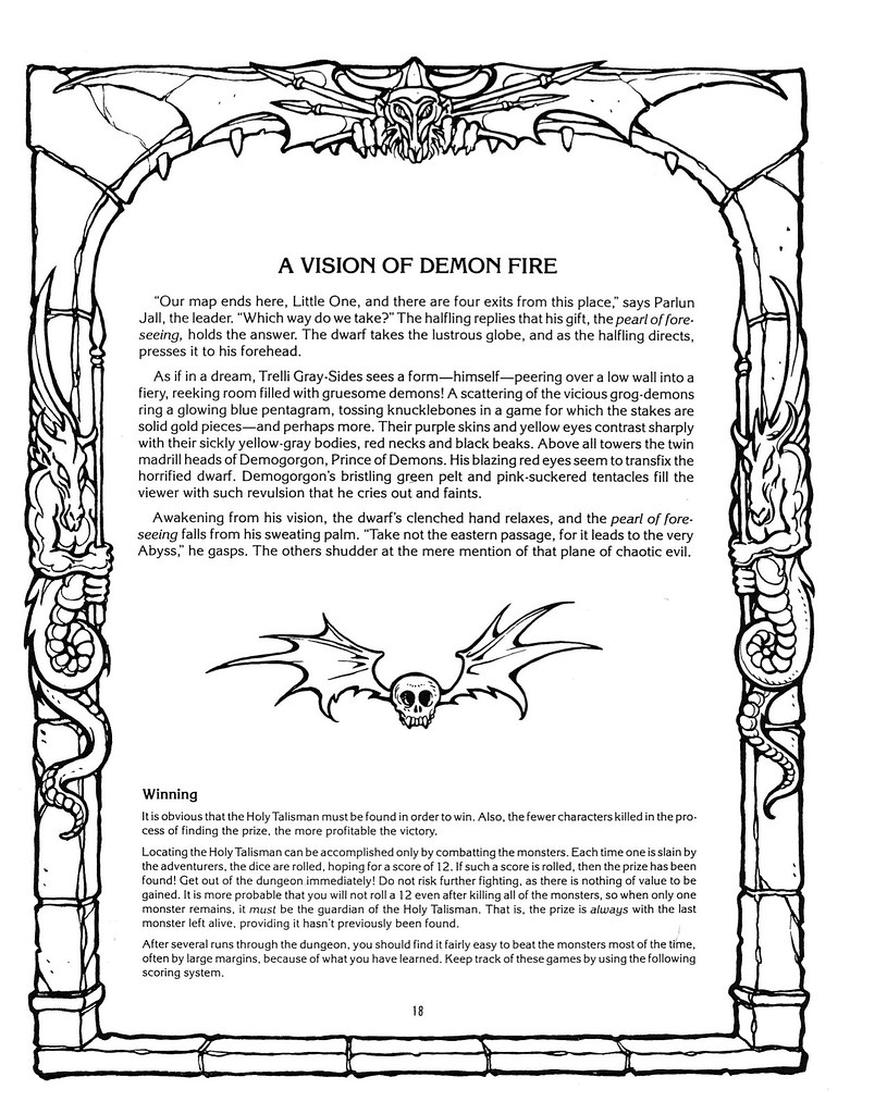
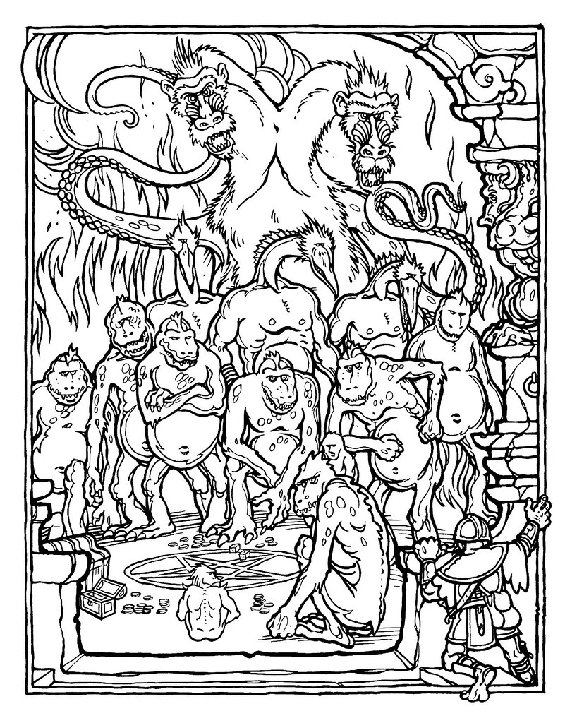
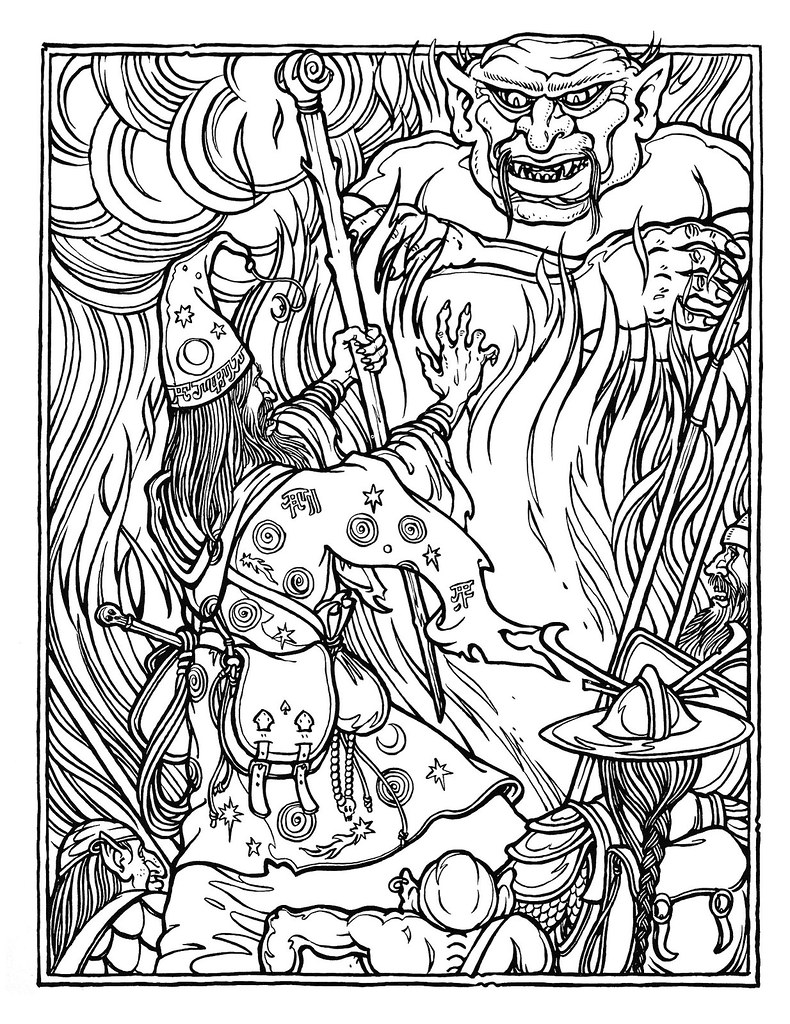
And last but not least is another item that was even older (released in 1979), but that my best gaming buddy at the time picked up "new" at a flea-market I think sometime around the summer or fall of 1985, and that we spent a lot of quality time with and was very influential on my mind's eye picture of D&D: the Official Advanced Dungeons & Dragons Coloring Album, with illustrations by Greg Irons and text by Gary Gygax.
This item has already been "rediscovered" by bloggers and gotten a fair amount of attention in recent years, including a blog post from 2011 that included the entire book (both text and pictures), but I still want to talk about it a bit, both because it was so cool and because thinking back it's likely that having spent so much time at this impressionable age with my friend and this book, reading Gary's text and carefully coloring the images to match it, as well as playing with those rub-down transfers of Trampier and Sutherland art, at the time when the look and feel of the official game was rapidly moving in a very different direction, is a big part of why my D&D tastes and aesthetic preferences were out of step with what TSR was offering up in the post-Gary era and why I gravitated towards the "old school" Gary-era aesthetic, even as it was disappearing from (and in some sense being actively repudiated by) TSR's official product lines.
Greg Irons was an underground comix and tattoo artist out of San Francisco, and his work didn't look like anything from the TSR art department, but - especially in combination with Gary's text - it still fit the mood of the game perfectly. The purpose of a coloring book is, of course, to present tableau images that will be fun to color in, so Gary's "story" is really just an excuse to set of a series of these tableaux, but he included enough detail and evocative flavor in those paragraphs to make it interesting, and to make sure that the subject matter wasn't just repurposed generic fantasy art, but was extremely specific to the AD&D universe. All of the characters and monsters come straight out of the game, and even though the style of the art is different than the rulebooks, the imaginary world being portrayed is unquestionably the same:
(Alas, one downside of the amount of fun my friend and I had with this coloring book is that once we had filled it up we went on to start coloring in the illustrations of the actual D&D modules - especially those illustrated by Jim Holloway, Jeff Dee, and Bill Willingham, including my otherwise-highly-collectible copy of R1: To the Aid of Falx...)
So all of that D&D art - the canonical TSR art, plus the AD&D toys, plus the D&D cartoon (especially those monsters that came out of the game - the orcs and bullywugs, shadow demon, Tiamat, etc.), plus these licensed oddities - are and always will be "what D&D looks like" in my imagination. And that association, as much or more as all of the changes made to the rules (which, as the books always told us, were really just a set of guidelines, suggestions, and examples anyway) is the reason why I've never been able to embrace the Wizards of the Coast editions of D&D. No matter what they call it, or how hard they try to play the nostalgia card, nothing they do ever looks or feels "like D&D" to me :(


I have some transfers that I never used downstairs somewhere. My brother used his. I was buying everything D&D the only thing that turned me off was the delay of shipping delivery. I ordered a huge shipment of miniatures from the Dungeon Hobby Shop in 1983 and it took forever to come. ERNIE!!! ;) In 1982, Kay-Bee Toys had a huge stock of D&D related stuff and by 1984 I had cleared them out. Certain things I didn't buy were the mini action figure plastic statues because I thought they were like buying the same thing but there were so many knock off army men, Grenadier D&D mini model kits and generic fantasy that you couldn't get around to getting everything even with the bread. My basement was loaded with an entire city of Star Wars sized figures with streets and there was a D&D section. There was a video tour of it but hell if I know what happened to that and all the VHS movies that I directed (I had one fantasy home movie called GROO AND THE QUEST FOR THE CHEESE DIP starring my brother as Groo the Wanderer from the comic and all the people that I was playing D&D with as monsters. From what I can recall it would be -5 stars. ;) )
ReplyDeleteFunny you mention the coloring book. It was put out by Troubadour Press, who put out a bunch of really awesome coloring books during the 70's that totally influenced my tastes in fantasy and sci-fi. in fact, just today I posted about the coloring book page dealing with the novel Dune (over on DF). They had books about movie monsters (such as dracula and the Fly), fantasy creatures, birds, and sci-fi books and movies. The War of the Worlds and Fantastic Voyage entries immediately jump to mind, and the whole series is worth checking out.
ReplyDeleteCool story about and interview with the founder of Troubadour Press, including a couple of paragraphs about the genesis of the D&D book:
Deletehttps://2warpstoneptune.com/2013/11/25/the-story-of-troubador-press-an-interview-with-malcolm-whyte/
Great find! Thanks for sharing it!
DeleteI think my comment was pretty mediocre looking at it today. Sorry. Art-wise its a major point. D&D art just isn't good at all in anyway whatsoever. You don't need to put a pin on it. Its huge. Andrew Lang era (1800's) folk tale collections have one zillion times better anything than any single illustration of anything called "D&D" these days. Frazetta is good but its still a vague world in Frazetta's brush. The Hildebrandt's paintings are the opposite. Too much detail without correlated material. I hate to bash the TSR paint squad but they need a good thrashing. Elmore gets treated like a god and he's dumb as a doorknob. His paintings remind me of a special fantasy episode of the Muppet Show with special guests Linda Ronstadt and Bruce Jenner. Caldwell's "bead worlds" remind me of a bad 70's style amateur photo session painted over sloppily. Easley's "shitty clothing/armor worlds" with his define as you paint style has no place in a game that is being brought from the page to the table. I don't know just some thoughts on the bad crap of that era. I have to say as time went on Truman's work stands up better than all of them because it seems more palpable. Its stylized sure but players like it. Sutherland got the worst rap. To dismiss Sutherland you have to dismiss yourself. Its true the guy was the master of conveying,"HEY, I CAN IMAGINE THIS." To have him shuffled off to mapping was the worst mistake that the Lorraine Williams' led TSR did. They lost the zeitgeist by the time Williams was aboard anyway. I recall painting miniatures from a Grenadier gold set, having just finished playing a solo game of Electronic Dungeons and Dragons and in the background a commercial for ARCHER: FUGITIVE OF THE EMPIRE being advertised on TV then me freaking out wondering what it was. 1981 was a huge year for D&D mentality so by 1983 the output was equally huge. The dialogues between people over what is a humanoid do not apply to whatever they're calling D&D because they've assumed so much already. Its like the whole pig orc thing. Pig-faced orcs were not universal the "Warhammer" type orcs were around and they weren't universal either. It was bigger than both. To see new age pig faced orcs just makes me cringe because they aren't conveying the hopelessness of the orc race from that era. I saw some company made new pig-faced orcs and all I could think of was Miss Piggy. I didn't get that back when Miss Piggy was popular and on TV every night.
DeleteOne of the biggest disconnects between me and folks who started playing D&D 4-5 years earlier, in addition to my greater acceptance of the Monster Manual II and Unearthed Arcana, is that I actually like most of Elmore and Easley's early (1982-83) stuff. It's what first drew me to the game, and seeing it on the store shelves made much more of an impression on me than the earlier Sutherland and Erol Otus art. I particularly like Elmore's 1983 Basic Set cover and Easley's 1983 DMG cover.
DeleteRecently an early draft of the Basic Set cover surfaced (Elmore is currently selling prints on his website) that has a different composition - it's more of a tableau scene with two other characters (an "Elmore lady" blonde cleric or wizard and a halfling thief) and more detail on the setting, and the dragon is much smaller and further back in the frame. The story (per Frank Mentzer) is that Gary looked at that piece and told Elmore to focus on just the dragon and fighter and make it really "pop." That was great advice - the way the picture breaks the frame is really dynamic and eye-catching in a way that the other version would not have been.
That said, "Project Overlord" seems to have spelled the doom of their art just as it did for "good" D&D generally - I can't think of a single thing either of them did from 1984 on is good or interesting to me at all. Maybe they should have kept listening to Gary ;)
I also love the Sutherland and Trampier art in the Monster Manual and Players Handbook (and of course Trampier's cover for the latter). All of that stuff, even where it's weak technically, is firmly entrenched in my subconscious and is timeless to me. Trampier, to me, belongs right up there in the canon of illustrators alongside folks like Howard Pyle.
What I like least is the "in-between" period (c. 1980-82) dominated by Jeff Dee and Erol Otus. I've come to appreciate Otus more as an adult - his surreal, druggy almost Dr. Seuss-y style - but I still really dislike Jeff Dee's stuff, especially his 1981 covers for The Village of Hommlet, which replaced a pair of gorgeous Trampier pieces on the 1979 pastel version.
An honorable mention also to a couple of TSR's later-era artists, whose work I liked so much that it convinced me to buy several products even after I should have known better - Stephen Fabian, who did moody black & white stuff reminiscent of Virgil Finlay, and Tony DiTerlizzi, whose pictures of bugs and faerie-creatures are reminiscent of Arthur Rackham or Brian Froud (and who went on post-TSR to considerable fame and fortune with his Spiderwick Chronicles series of children's books).
I retroactively disliked Dee and Otus even though I learned to associate them with good stuff. Otus I thought was B- because he was never descriptive and Dee I never liked (bell bottoms and weird visors) but at least he was descriptive of things although his art was inferior.
ReplyDeleteBashing the big TSR painters is easy pickings.
Stephen Fabian illustrated MANUAL OF THE PLANES and many of the early RAVENLOFT world series. I had the tarot deck by him but I think I tossed it. Those Ravenloft books (I bought all of the first wave. Big mistake.) were weak anti-D&D mood setters with little content. Terrible.
DiTerlizzi - is like the D&D art antichrist to me. His kobold sketch from the compiled MONSTROUS MANUAL hardcover gave birth to a million shitty kobold drawings.
Yeah, you're right that their art didn't really fit the aesthetics of Gary-flavored D&D, but I still liked it as art
DeleteDark Crystal (Froud/Henson) is what DiTerlizzi and Elmore should have surpassed or left it alone. I feel comfortable using a Dark Crystal gateway but not a DiTerlizzi clock hell or an Elmore "Snarf-iverse". Just too derivative. Pressing it, I'd take Miss Piggy and Kermit in armor at least people would know they're not getting a derivative pretensious display.
DeleteMUPPET
FREQUENCY: Very rare
NO. APPEARING: 20-100 (traveling 1-4 see below)
ARMOR CLASS: 8
MOVE: 12"
HIT DICE: 1+1
% IN LAIR: 100% (unless on a journey: 0%)
TREASURE TYPE: Nil (usually fake jewelry)
NO. OF ATTACKS: 1
SPECIAL ATTACKS : Body Flop (see below)
SPECIAL DEFENCES: Arm Flail Run (see below)
MAGIC RESISTANCE: Standard
DAMAGE/ATTACK: 1-3
INTELLIGENCE: Low to Genius
ALIGNMENT: Chaotic (Unless establishment figure then Lawful)
SIZE: S
PSlONIC ABILITY: Nil
LEVEL/X.P. VALUE: II/28 +2/hp
These beings come in many varieties and may be very distantly related to the ancient Fomoirhe. When traveling they spread out so only assuming there are a handful around but the entire lair group will be lurking just out of eyesight and will appear if one of them starts singing.
The body flop attack has the same damage as the normal attack but it has the chance to stun for 2 rounds.
The Arm Flail Run adds a 50% chance to completely disappear from a 50" area.
Occasionally there will be a large variety who emerges sometimes an elephant, a bird or a giant. Treat these as having 2HD.
Description: 3 foot tall on average, the human-like types almost feel like they are made of smoothed fleece cloth and have human-like hair although skin tone ranges in a weird spectrum. The typical kind have animal features with an occasional female having human like hair.
Sorry, I had to at this point... ;)